ID
Authored on
Iconic logo created by a Blugold set to make its second World Series appearance
Published on:
Intro text

It’s one of the most iconic logos in all of sports, and it’s about to celebrate its 50th anniversary and second World Series appearance.

It’s the ball-in-glove logo of the Milwaukee Brewers. Or, for some, it’s the m-and-b logo. They are, of course, one in the same.

Sections

The logo is familiar to millions of baseball fans, but many people do not know the logo was created by a Blugold.

Tom Meindel was an art major at the University of Wisconsin-Eau Claire in 1977 when the Milwaukee Brewers made a call for entries for a new team logo. Meindel drew the letters m and b. When put together, the letters formed a picture of a glove with a baseball centered in it. It was one of nearly 2,000 entries the team received.

His wife, Elaine Meindel, knew the first time she saw it that it would be the winning entry.

“He came home with this design, this logo, and I went, ‘Oh my God, don’t change a thing, send it in right now,’” she told the New York Times in 2018. “That was perfect, the best logo I ever saw.”

As for Meindel, he told the UW-Eau Claire campus newspaper The Spectator he heard about the contest while watching a sports report one night, and a few days later, while watching the World Series, an idea came to him.

“I went to my drawing room and started working with variations of the lowercase m’s and b’s,” Meindel told the newspaper in December 1977. “Finally, I stumbled onto the combination which formed a glove with the ball in it.”

1977 Spectator article screen shot
Tom Meindel spoke with UW-Eau Claire’s campus newspaper The Spectator about how his logo was selected by the Milwaukee Brewers.

The ball-in-glove logo was an immediate hit with fans

Meindel’s logo was chosen as the winning entry by the Brewers, and it became synonymous with the team starting with the 1978 season.

It was the Brewers logo until 1993, when it was retired and a new block letter format replaced it.

But fans never forgot about Meindel’s creation. They kept asking for its return, and in 2006 the Brewers brought the ball-in-glove logo back for special occasions. Then in 2020, the Brewers went back to the past and brought a slightly adjusted logo back on a full-time basis.

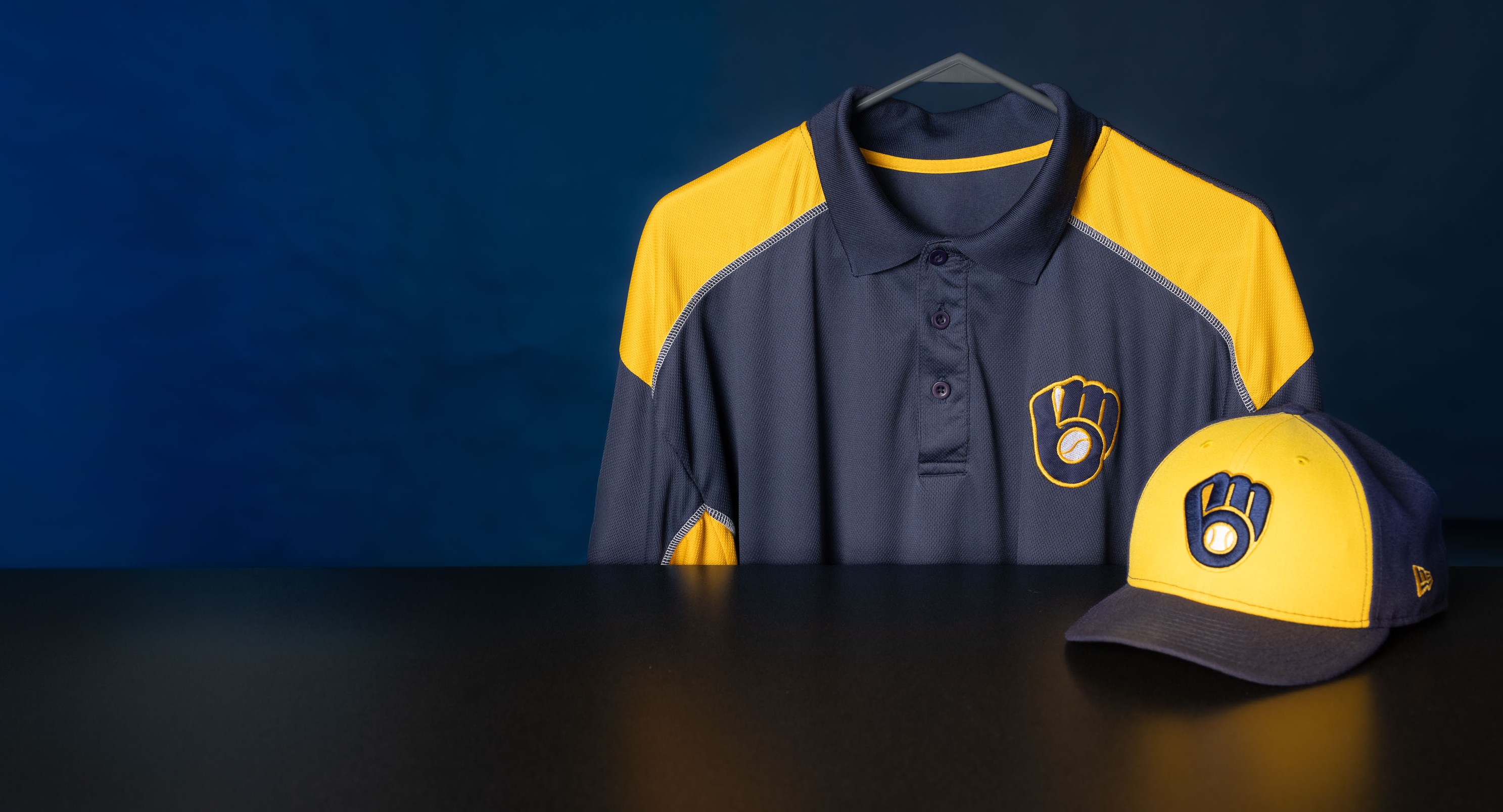
close up shot of Brewer logos
The polo shirt shows the original 1977 logo created by Tom Meindel. The baseball cap shows the newer, slightly adjusted logo in use since 2020.

Blugold creativity comes as no surprise

Tim Skutley, the interim vice president of development for the UW-Eau Claire Foundation, says Meindel’s work of art all those years ago is a great example of how Blugolds make a difference in all kinds of professional fields.

“Blugolds continue to excel in research and creative pursuits,” Skutley says. “Our graduates engage in innovative activities across a wide spectrum of endeavors to enhance UW-Eau Claire’s reputation.  We are proud of our Blugolds and all that they accomplish.”

The ball-in-glove logo Meindel designed was a part of the Milwaukee Brewers uniforms during the team’s first World Series appearance in 1982. Sadly, Meindel passed away in 2018, but his work lives on. His iconic logo will once again take the field in the fall classic, 44 years after it appeared in its first World Series and 48 years after it first appeared on a Milwaukee Brewers uniform.

For the media
For the media
Image download